A 1970s architectural sketch and Otl Aicher inspire North Design’s new art centre brand mark
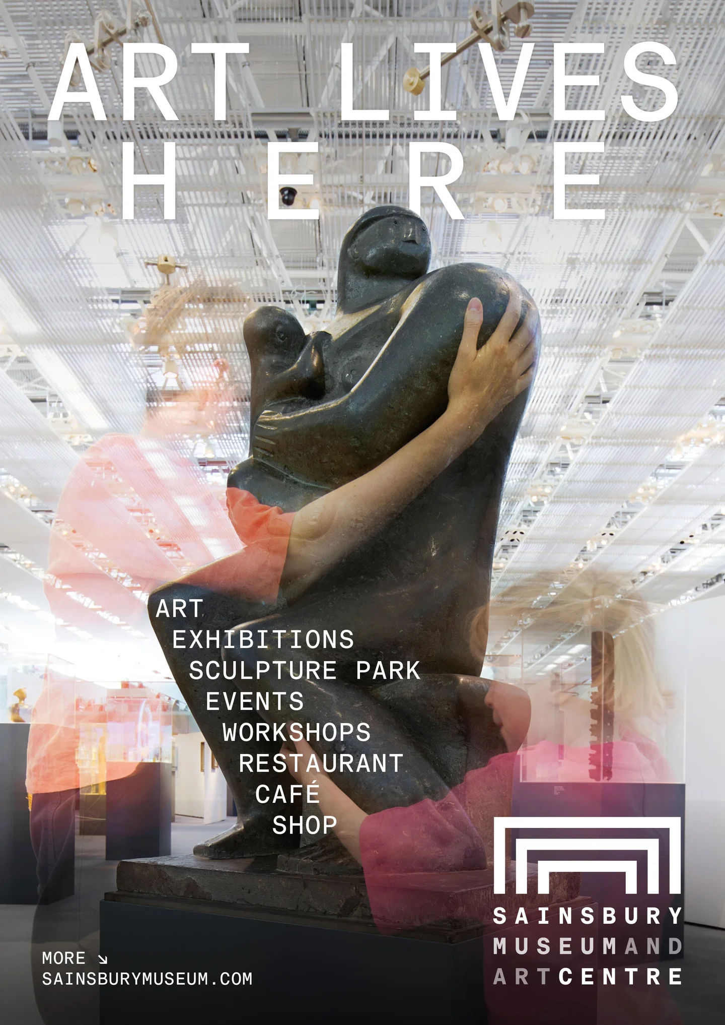
North Design’s list of projects for the UK’s iconic cultural institutions is long, very long. It includes brands for Magnum , Manchester’s Factory International , the Barbican , Somerset House , and the Tate . And now, the studio has added another string to its cultural bow – a rebrand of The Sainsbury Museum and Art Centre, formerly known as The Sainsbury Centre. Opening in 1978, the vast Grade II-listed building (which is the largest open-plan building in Britain) sits in the grounds of the University of East Anglia and was one of architect Norman Foster’s first major projects. It was within his original plans, kept within the museum’s archive, that North discovered the anchor of the project – a sketch outlining the structural steel frames that would later form the skeleton of the building. These three interlocking forms have been harmonised into a nest-list structure to make up the institution’s brand mark. When building it, North also referred to Otl Aicher’s design ethos of ‘intelligent geometry’ – the use of mathematical grids and uniformity in expressive ways – to ensure it was rooted in “genuine architectural heritage”, a press release outlines. North Design worked on a custom, uniwidth typeface, SM Baumer Mono, to support the identity. It exists within a typographic engine that has two modes, ‘Functional’, for formal applications like administrative and wayfinding, that keeps spacing between each glyph regular, and an ‘Expressive/Living Mode’ which allows for more uneven spatial relationships, resulting in more unexpected lettering layouts for posters and digital environments. Meanwhile, like the mark, the new colour strategy pulls directly from the building, its primary palette taking hues from its raw materials – aluminium, structural steel, glass and concrete – allowing for new, more vivid palettes to be applied with new exhibitions and acquisitions. “Building on the legacy of Norman Foster and Otl Aicher was an extraordinary privilege. Architecture and art of this calibre call for a visual identity created with equal rigour and restraint,” says director at North Design, Sean Perkins. “Drawing directly from Foster’s iconic grid and the gallery’s vibrant collection, we created an identity that lives and breathes with the museum itself – dynamic, living and radical across both print and digital.” The rebrand comes alongside the aforementioned positioning change, which returns the institution to its original name, and recentres its position as both a museum and a home for ‘Living Art’, a concept launched by the museum in 2023, a press release details. “Reverting back to the original name written in the museum's founding deeds, this rebrand is intrinsically linked to this phenomenal museum’s history and identity,” says director Jago Cooper. “Our new brand and more descriptive name will help a whole new generation of visitors discover us.”